Azealia
Branding
Brand Identity & Packaging
Client
Azealia
Creative/Art Director
Luigi Durante
Graphic Design
Luigi Durante
Michele Viscomi
Collaboration
Photography
Carmen Mitrotta
Year
2024
Discipline
Brand Identity
Packaging
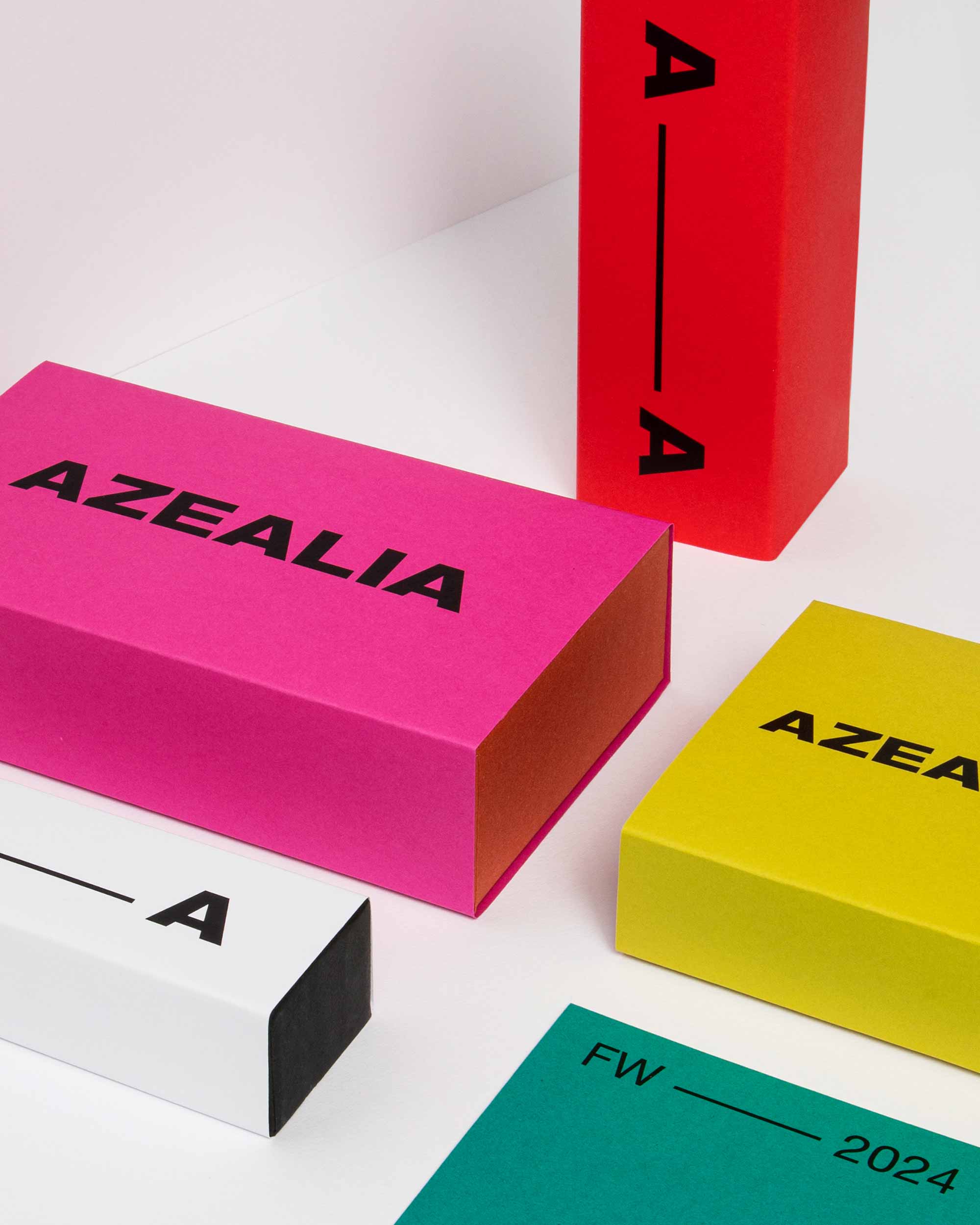
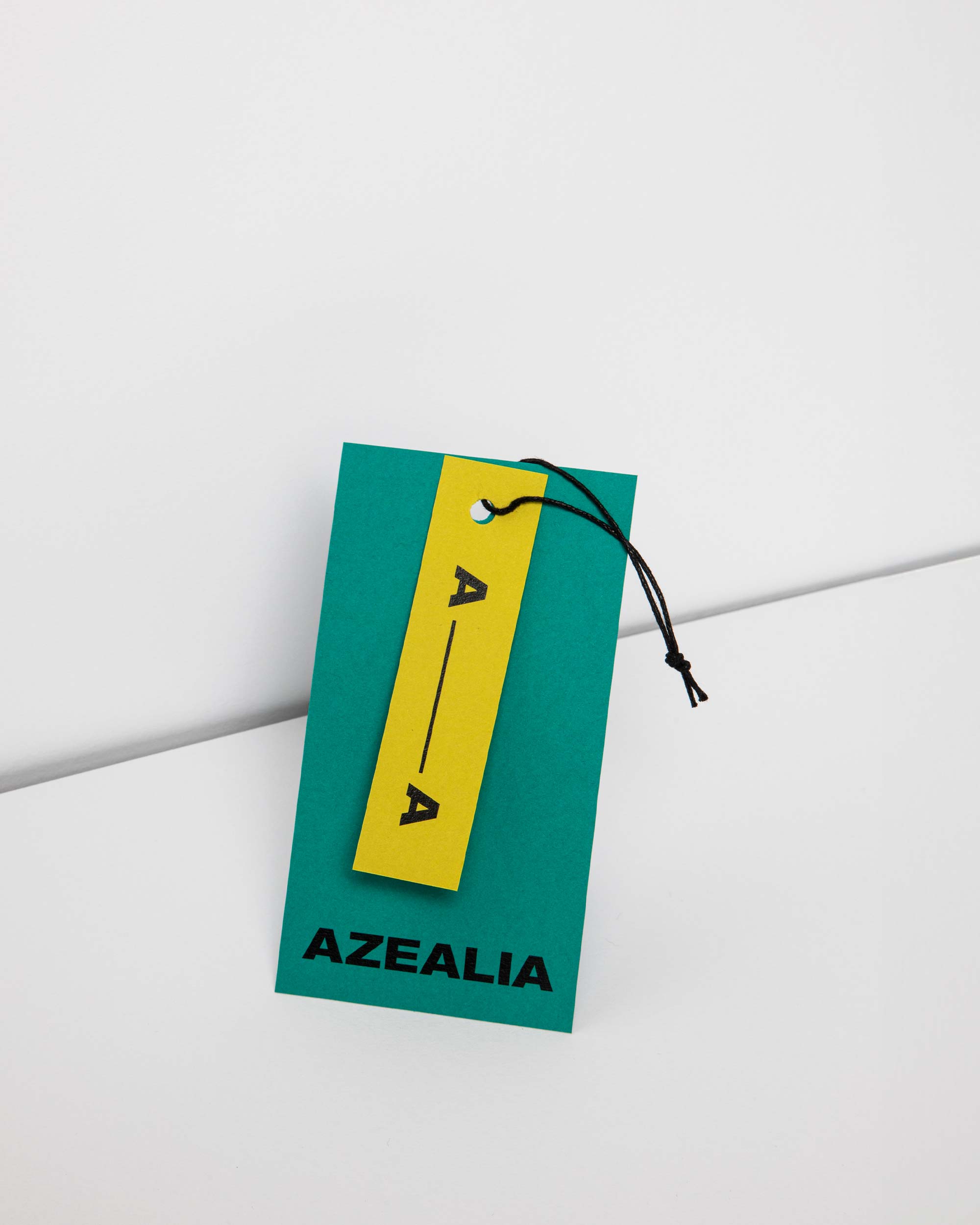
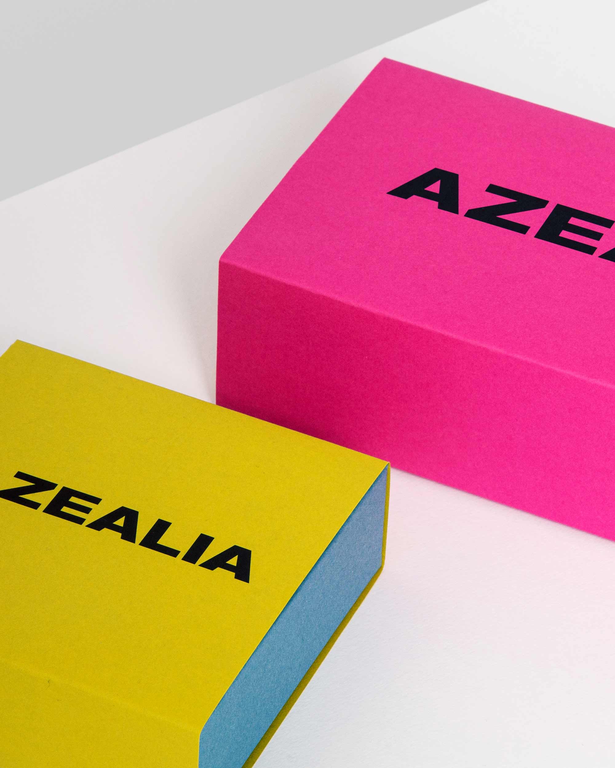
The identity we designed for the Azealia brand is based on a simple and dynamic symbolism: a line that starts from the first letter "A" and extends to the last, evoking a continuous and uninterrupted flow. This graphic element represents the essence of Azealia: infinite creativity and constant dynamism. Like a thread connecting every aspect of the brand, the line becomes a metaphor for an evolving journey, without boundaries, where innovation is constantly renewed.







All projects
Martesana RebrandingBrand Identity

Baglioni Hotels Italian styleBrand Identity
BallyVisual Design

Martesana – Preserves and creamsPackaging Design
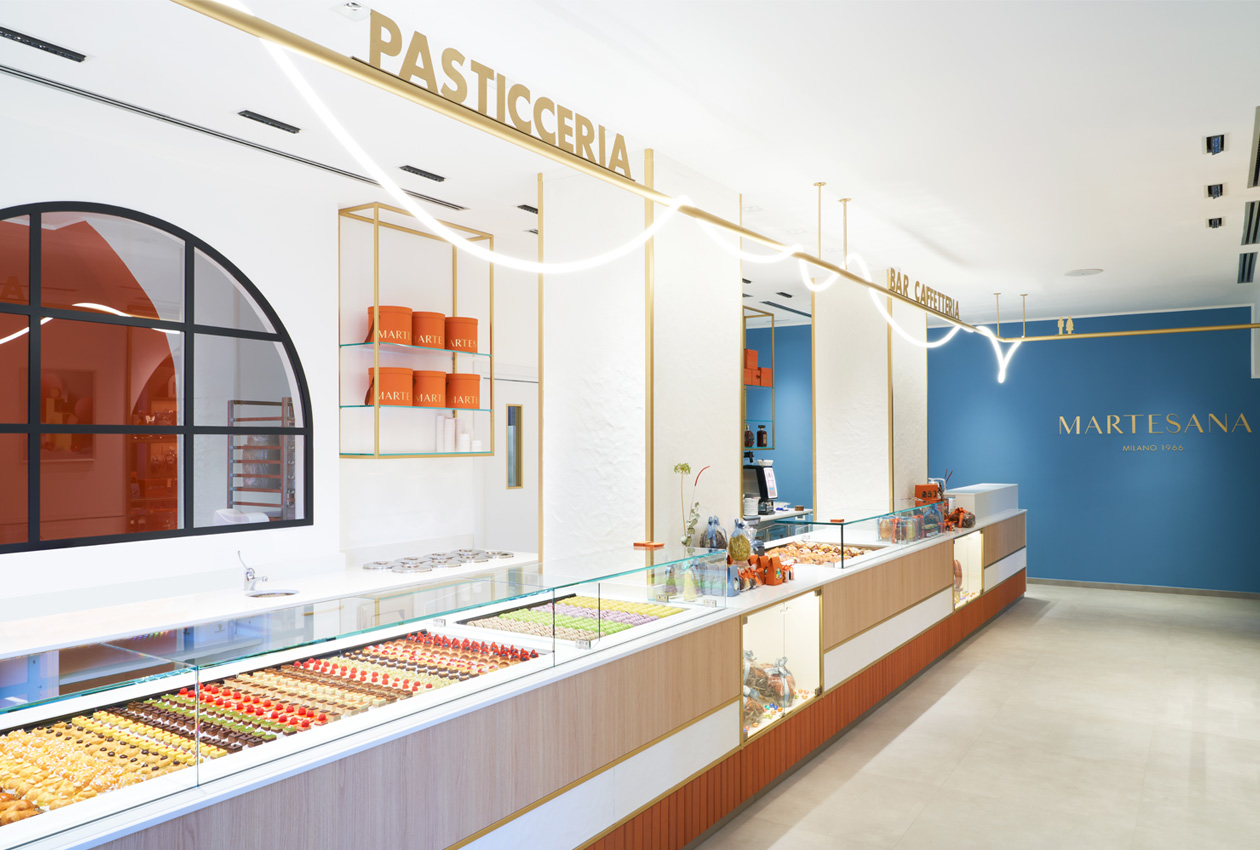
Martesana New pastry shopInterior Design
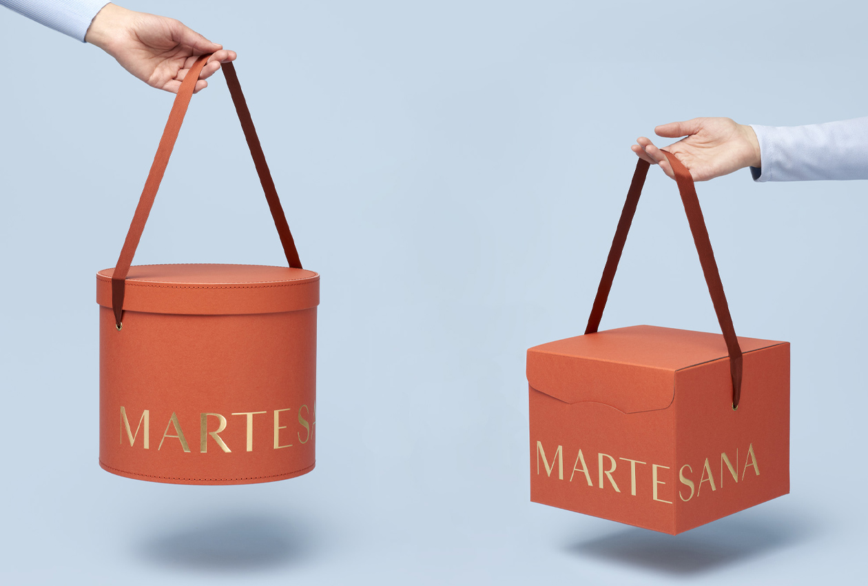
Martesana Christmas PackagingPackaging Design
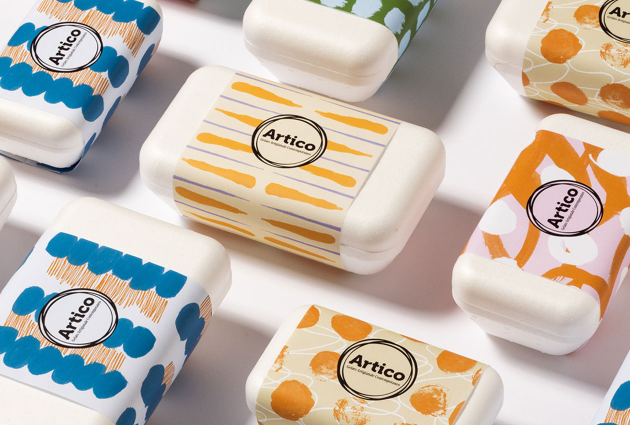
Artico Gelateria Brand identityBrand Identity Packaging design
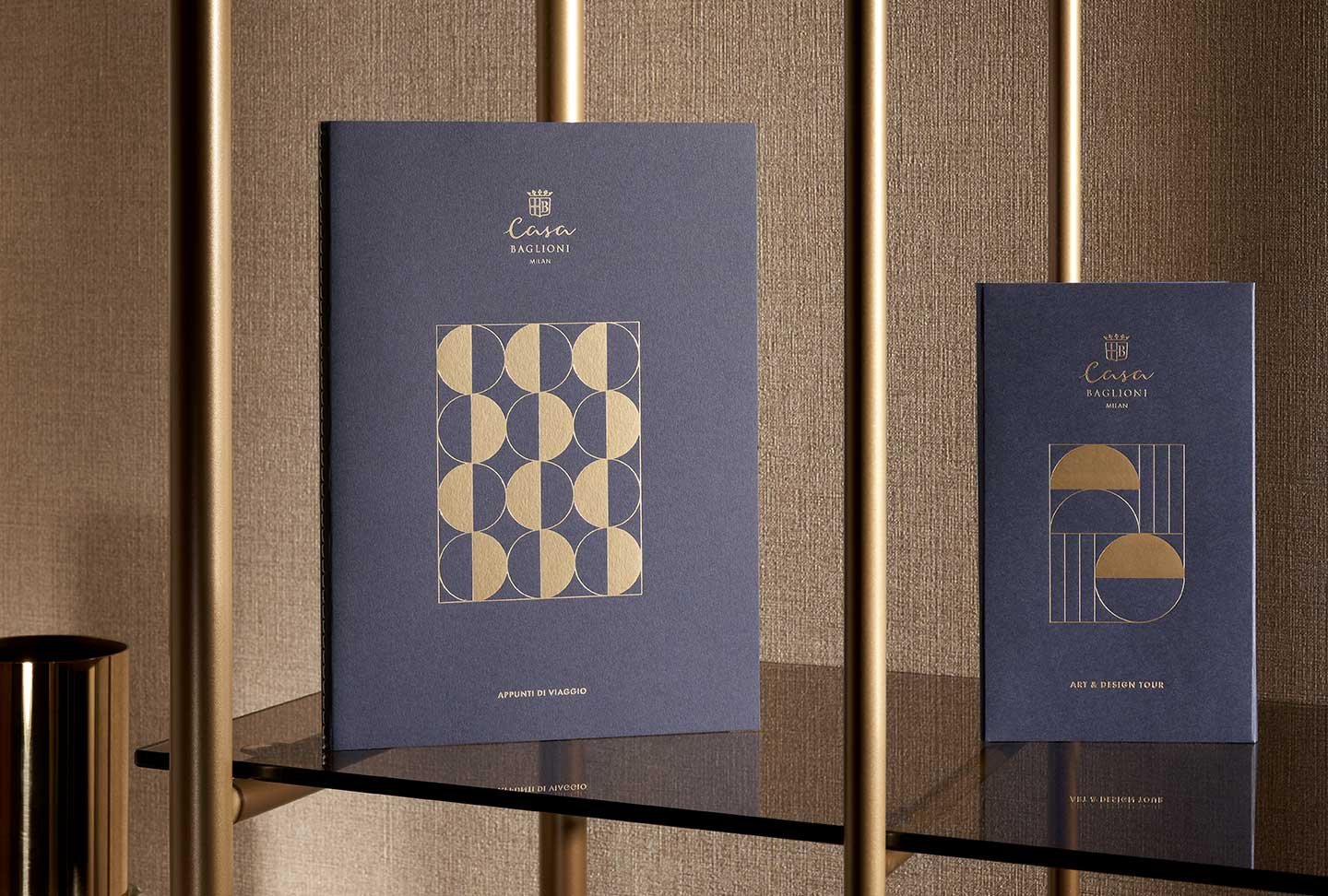
Casa Baglioni Brand IdentityArt Direction, Brand Identity
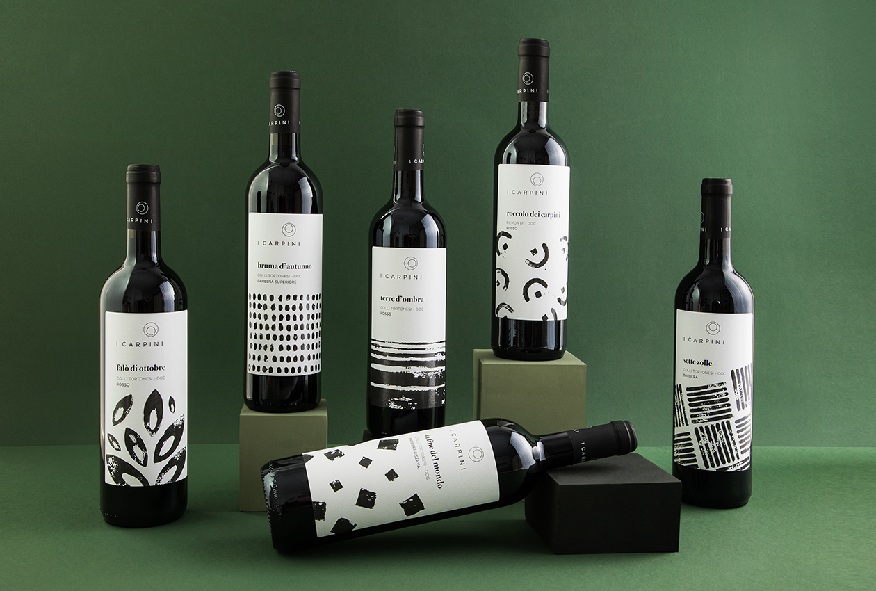
I CarpiniBrand Identity
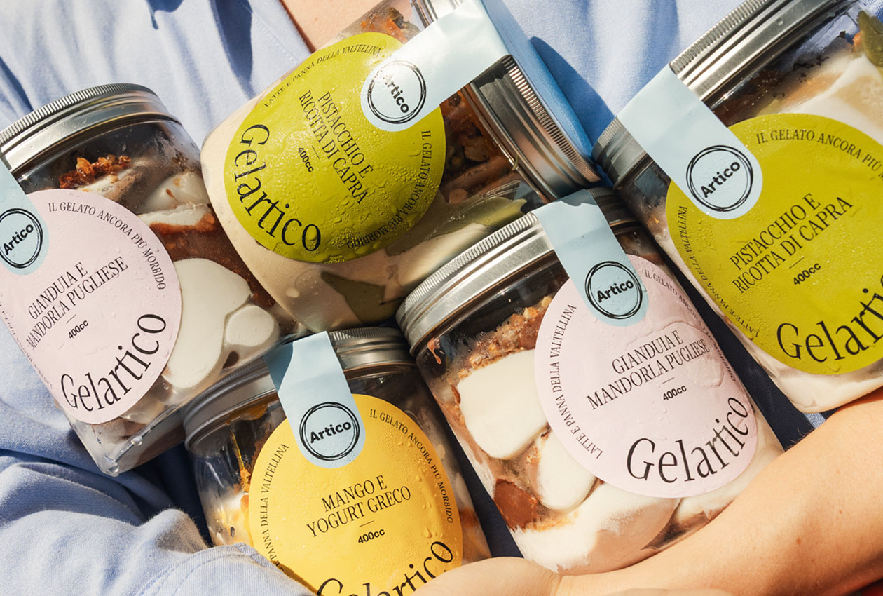
Gelartico Packaging DesignBrand Identity Packaging design
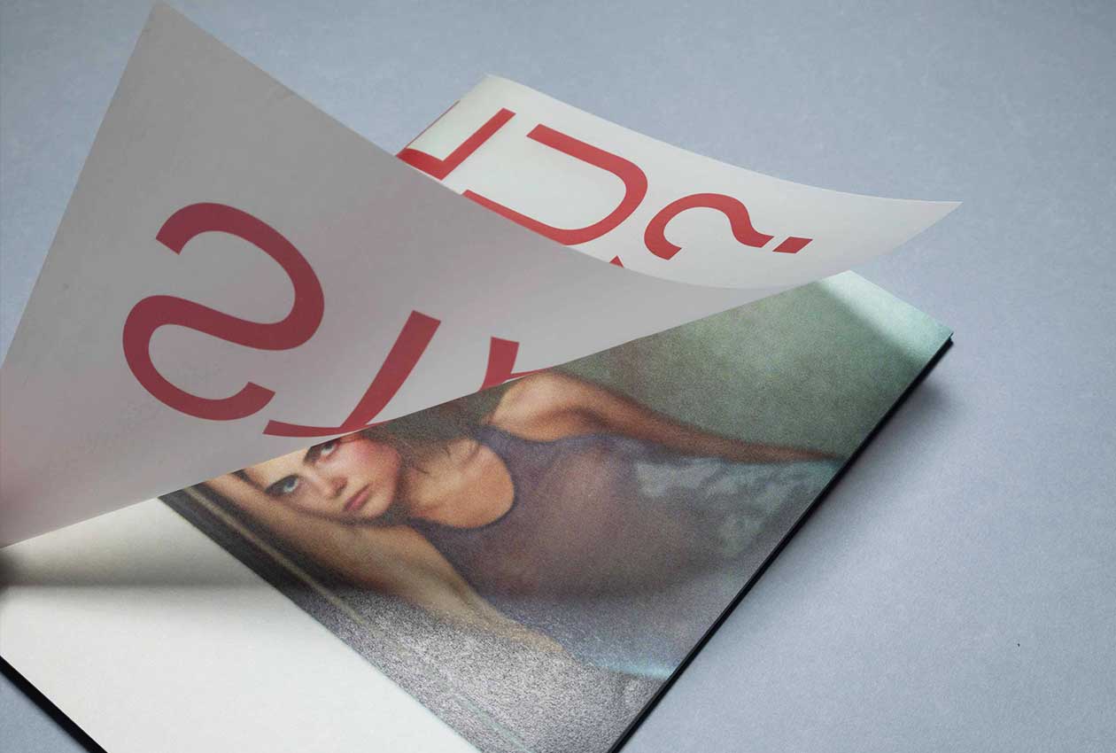
Can I just make you stay?Editorial Design
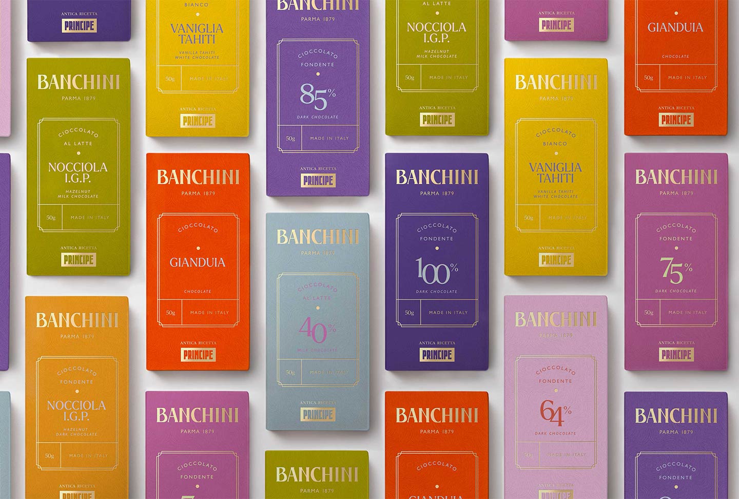
Banchini Parma Chocolate BarArt Direction, Brand Identity & Packaging
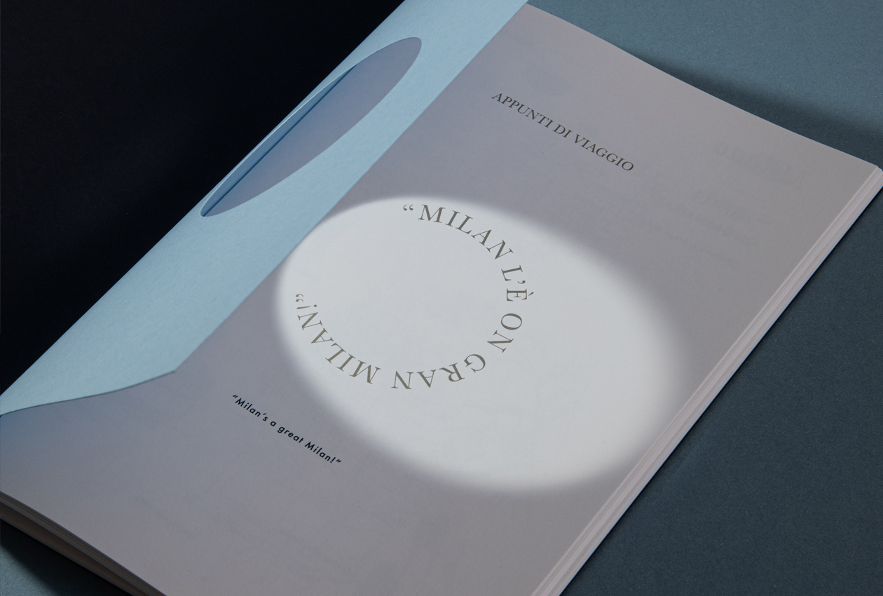
Casa Baglioni Milan Appunti di ViaggioArt Direction
Banchini Parma New IdentityArt Direction, Brand Identity & Packaging
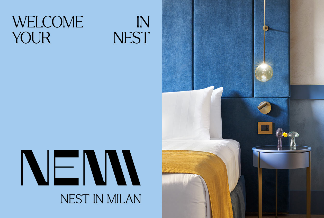
Nemi Hotel - Nest In MilanBrand Identity
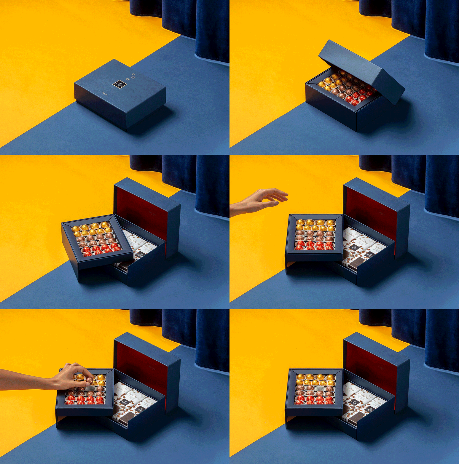
Amedei Bluniverso PackagingPackaging Design
Studio SymphonicoBrand Identity
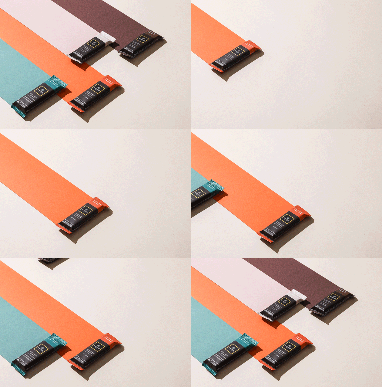
Amedei Chocolate SnackPackaging Design
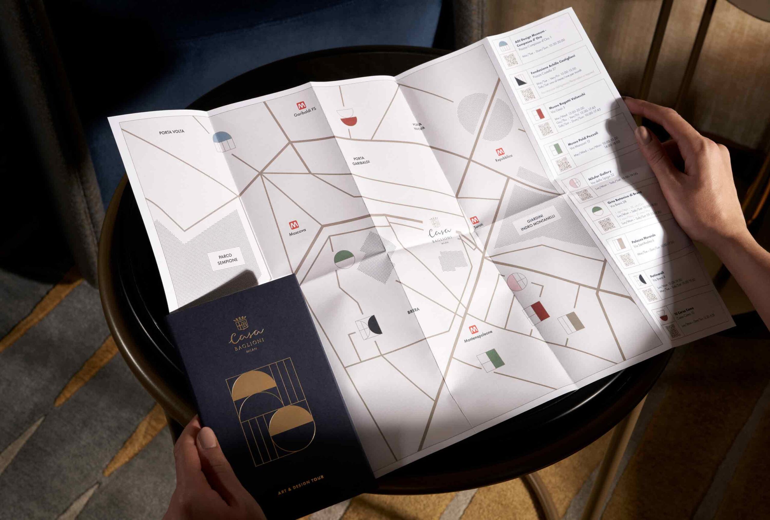
Casa Baglioni Milan The Art & Design TourArt Direction
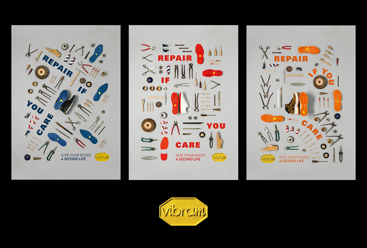
Vibram Repair CampaignAdvertising Campaign
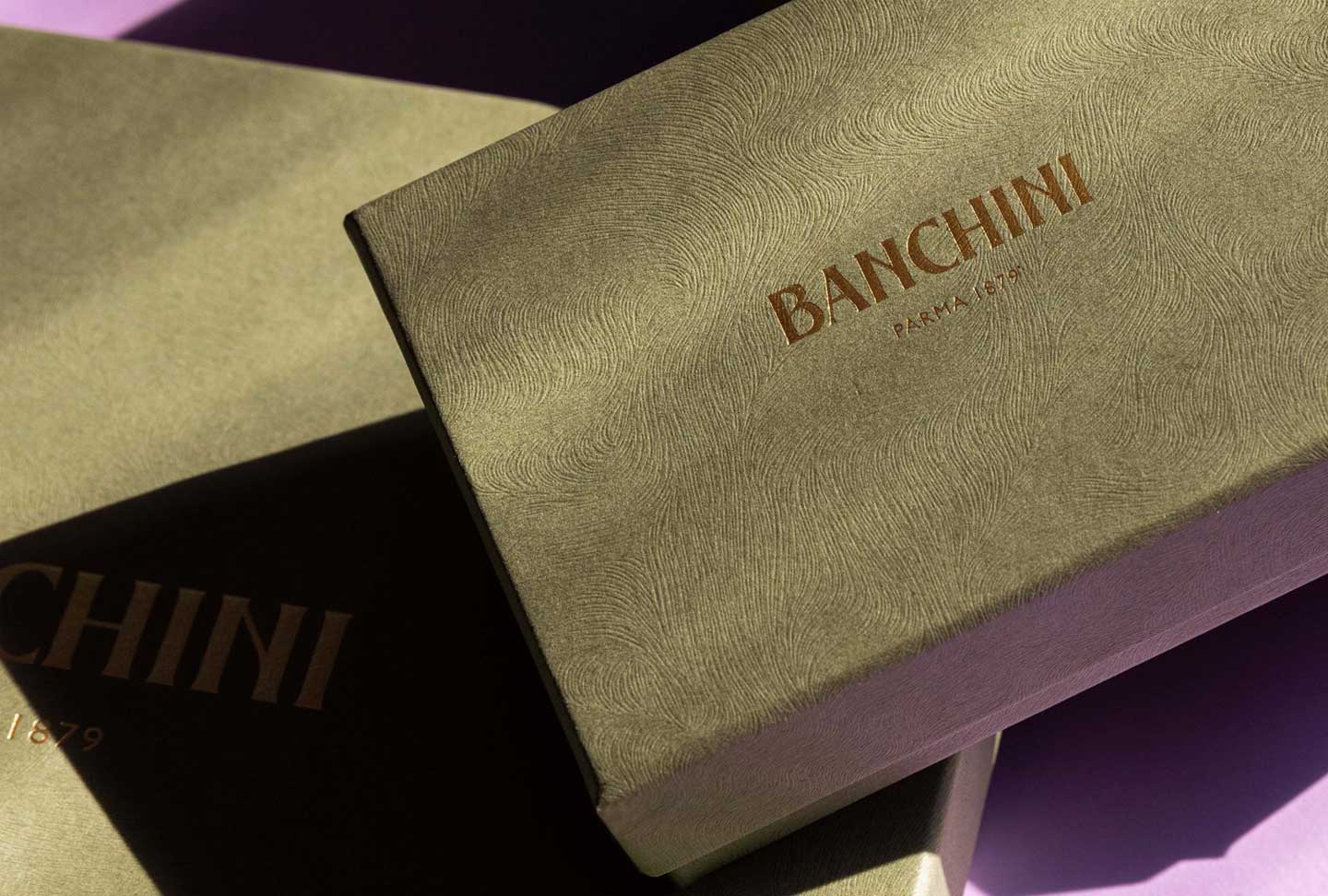
Banchini Parma Praline BoxesArt Direction, Brand Identity & Packaging
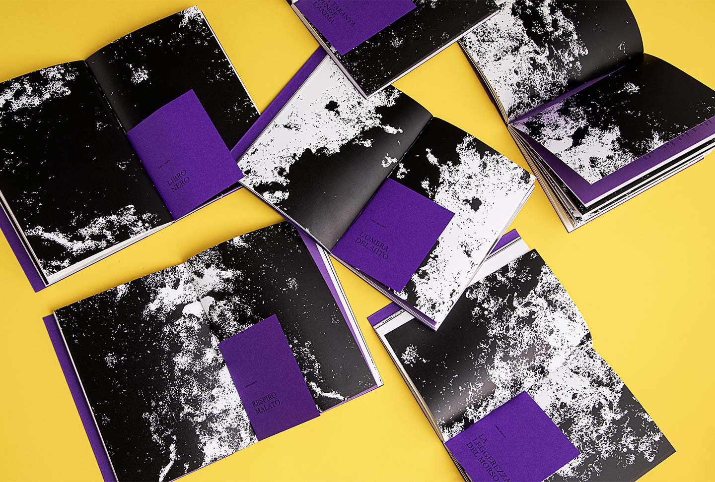
Morsi e RimorsiEditorial Design
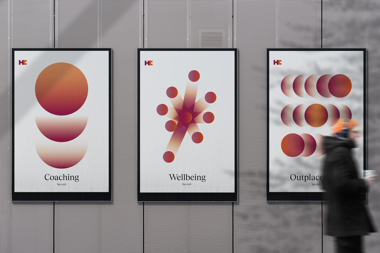
HC web siteWeb Design & Brand Identity

Baglioni Hotels "Appunti di Viaggio"Editorial Design

Zegna windows displayWindows Display Design
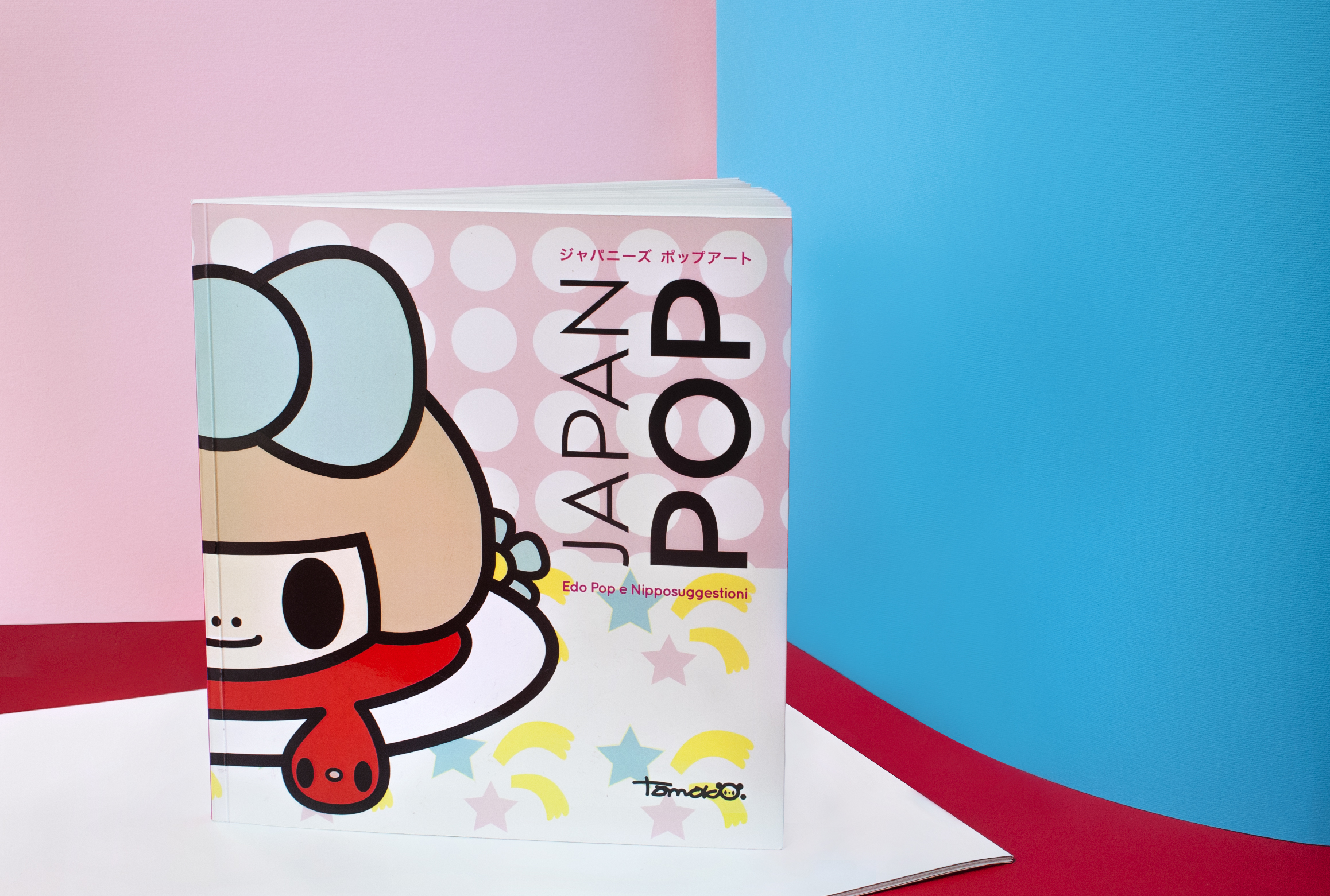
Japan PopEditorial Design

Salento Wild RanchBrand Identity
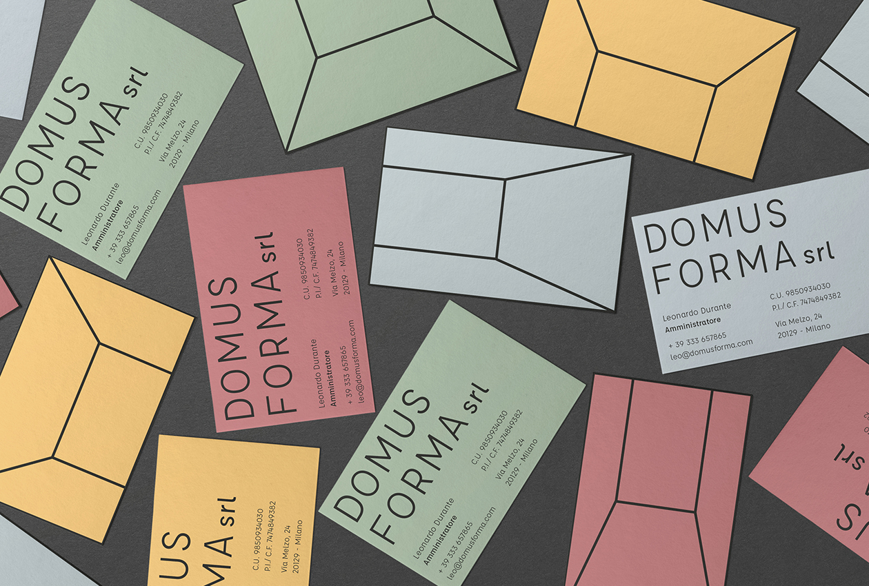
Domus FormaBrand Identity

Leadership Track ZegnaBrand Identity
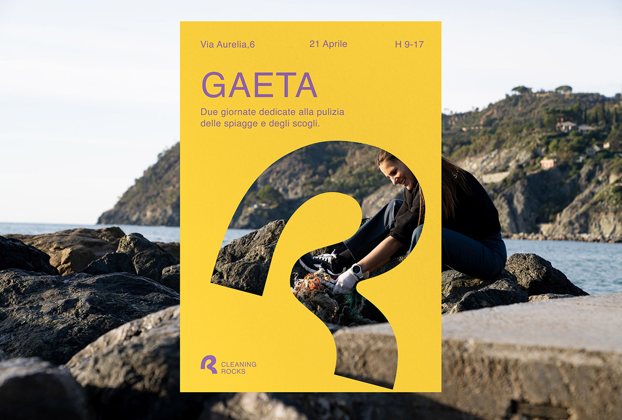
Cleaning RocksBrand Identity

Margherita Cavallo IdentityBranding
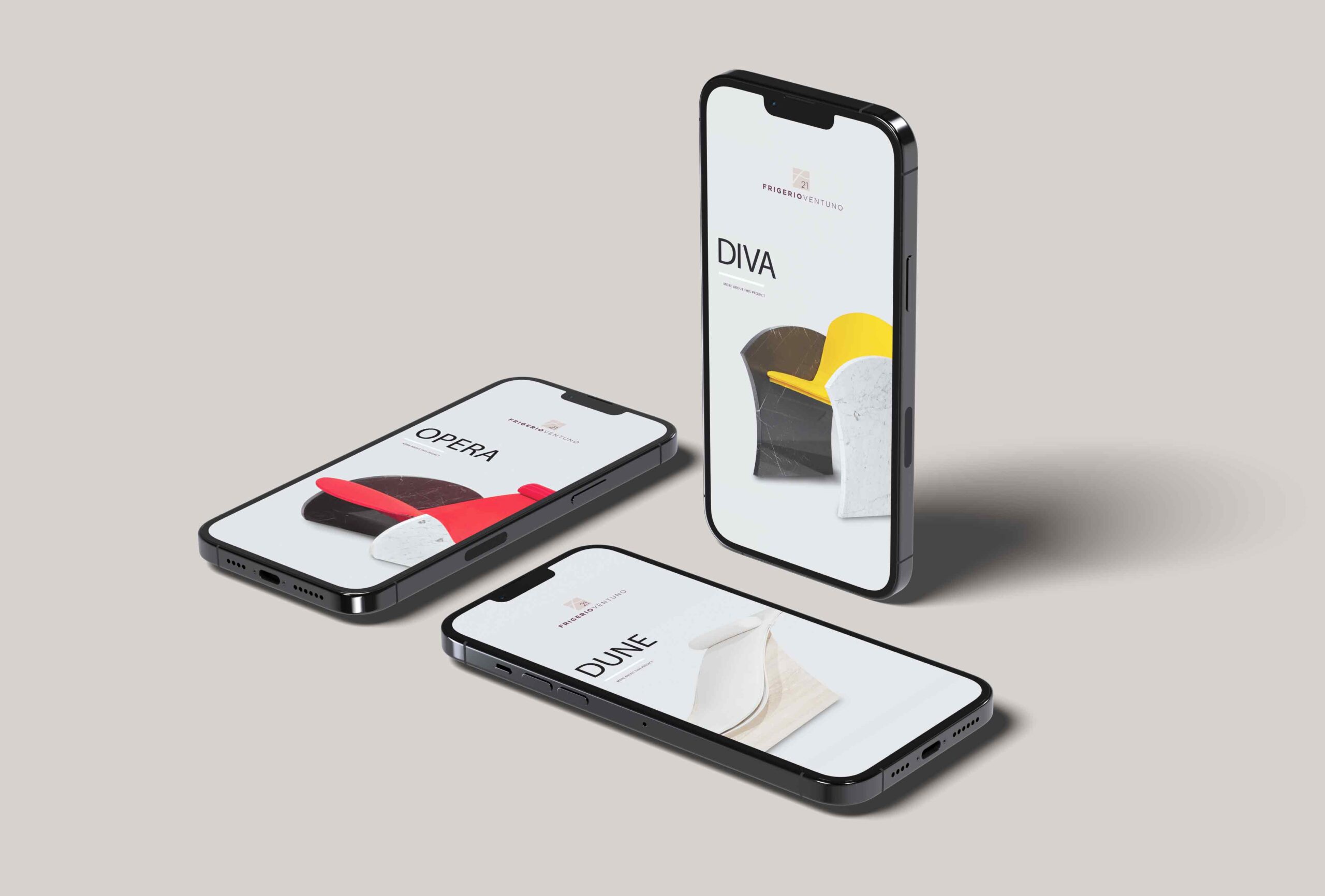
Frigerio 21Web Design

Habitat - abitazioni d'artistaEvent Identity
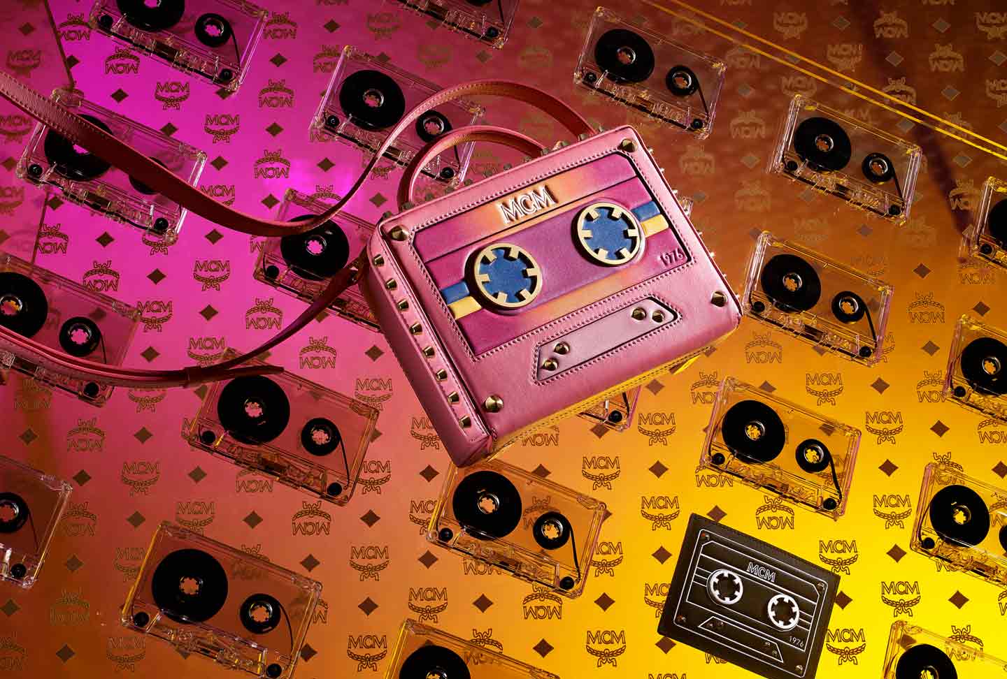
MCM Windows DisplayWindows Display Design
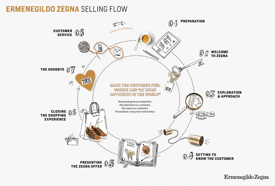
Ermenegildo Zegna - Selling FlowRestyling
Music WeekBrand Identity

R21 creative agencyBrand Identity

Andaf online courses identityBrand Identity
Olga Frua catalogueEditorial Design
Drogheria Studio IdentityBranding

Olga Frua websiteWeb Design